Redesigning Mittelfest
Category
Mittelfest is a festival of music, dance, theatre and visual arts from Central Europe. Its 25 year tradition has made the festival internationally recognized, bringing crowds to Cividale del Friuli, a historical city in Italy, where the festival takes place every summer.
We were commissioned to redesign Mittelfest’s identity due to its lack of connection to the festival and years of inconsistent use of Mittelfest’s identity elements.
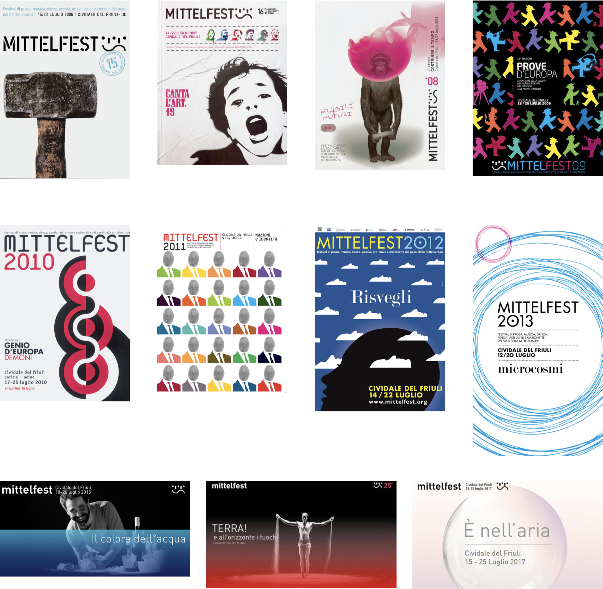
Below you can view posters of old Mittelfest editions from the year 2006 up until the year 2017. What we noticed is a lack of connection between each year’s identity.
Mittelfest posters
2006-2017
Logotype analysis
We noticed inconsistency in terms of typography, sign shape, colour, editions, year and theme.
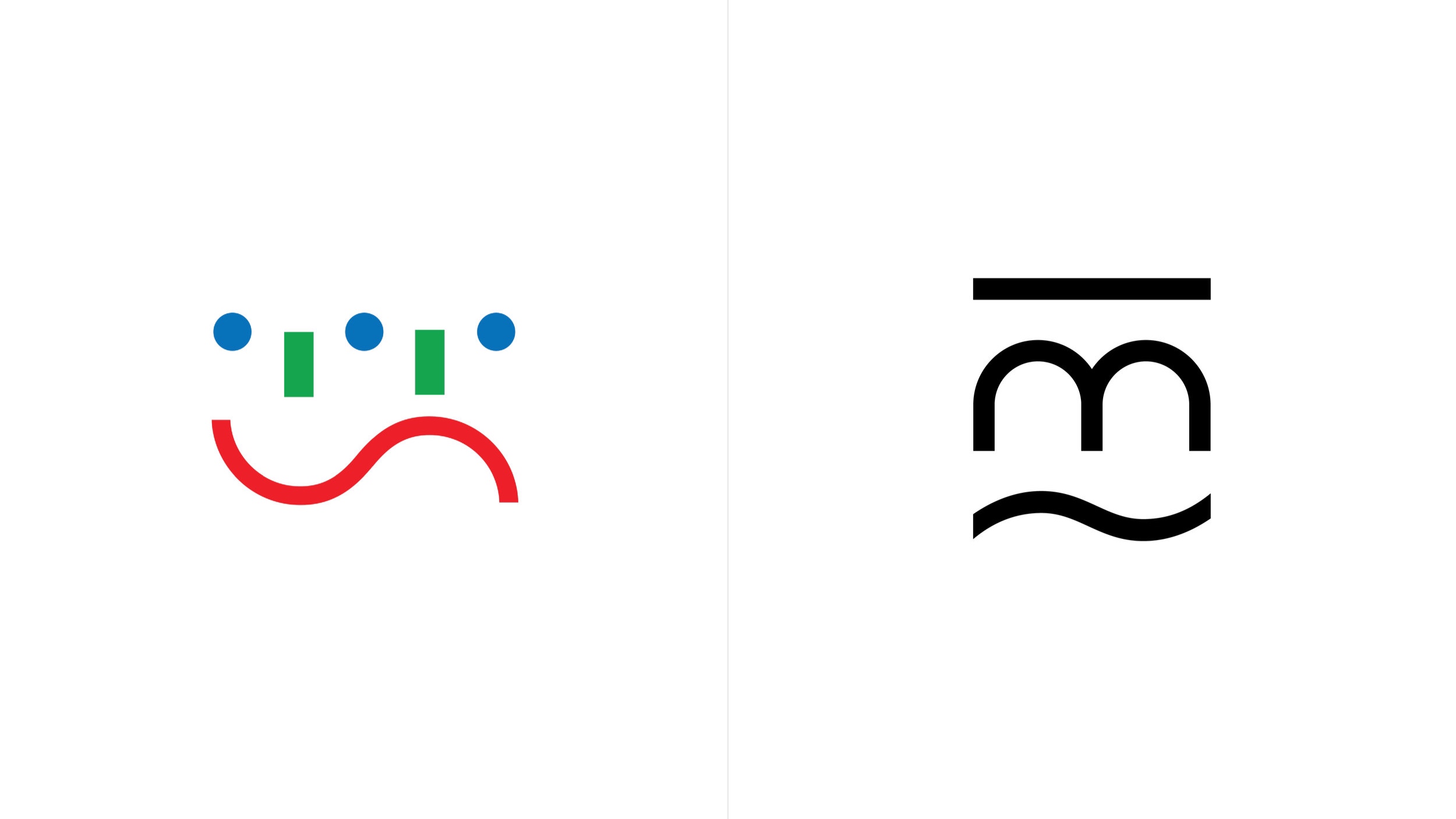
We appreciate the old mark’s simplicity in terms of visual language but we observed that it no longer has a full connection to the festival as it depicts only a small fraction of the festival’s programme—theatre. It also uses too many colours (the original mark uses blue, green and red colour) which is why it rarely ever even appears in colour. One of the main issues was also inconsistent typography use of the wordmark Mittelfest and its positioning.

Information structure
Based on our research, we defined the festival’s information structure and hierarchy.
What we noticed in the previous editions was the use of numbering the festival’s edition which has proven to be a bit confusing when looking at the past editions. Is Mittelfest 09 the 9th edition of the festival or is it the year 2009? This is the reason we decided to retract the edition numbering and focus only on the year.
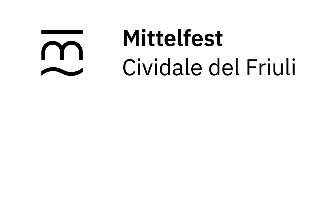
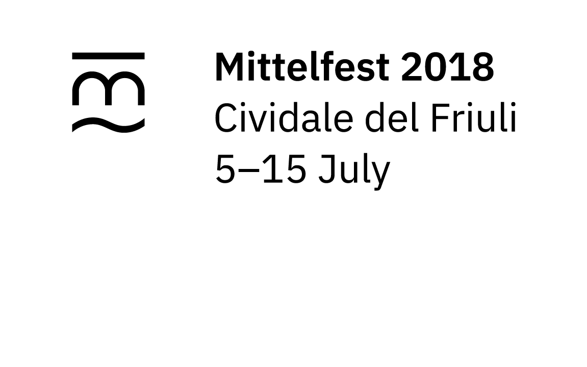
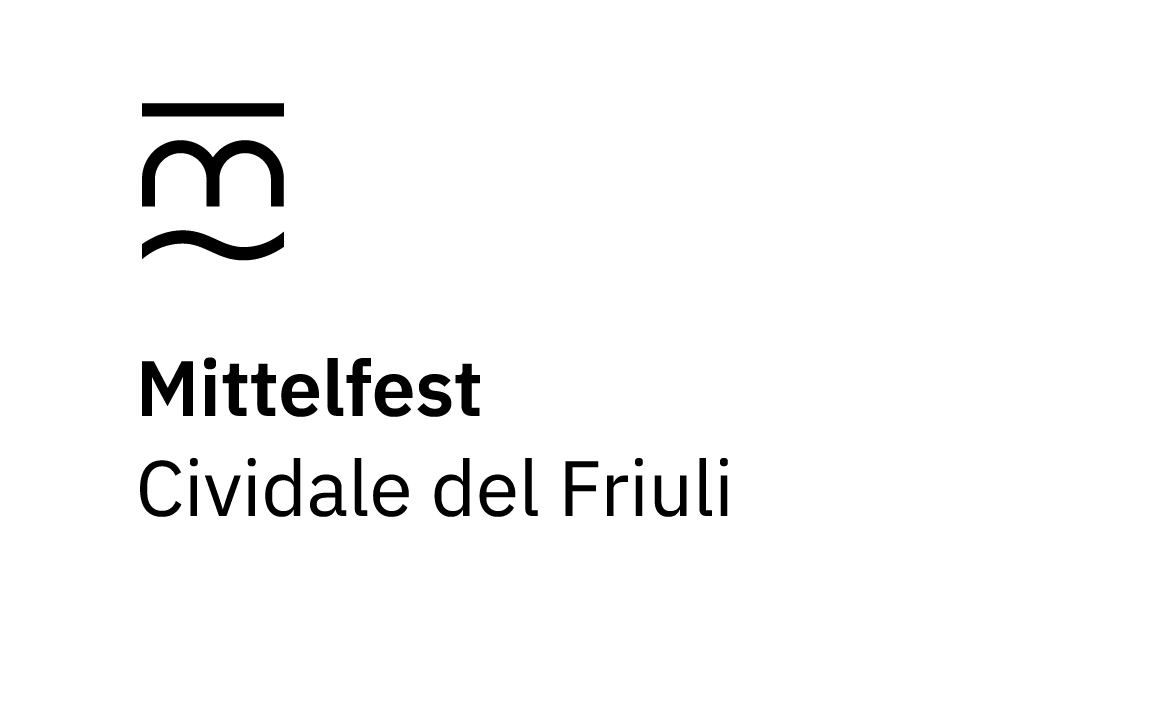
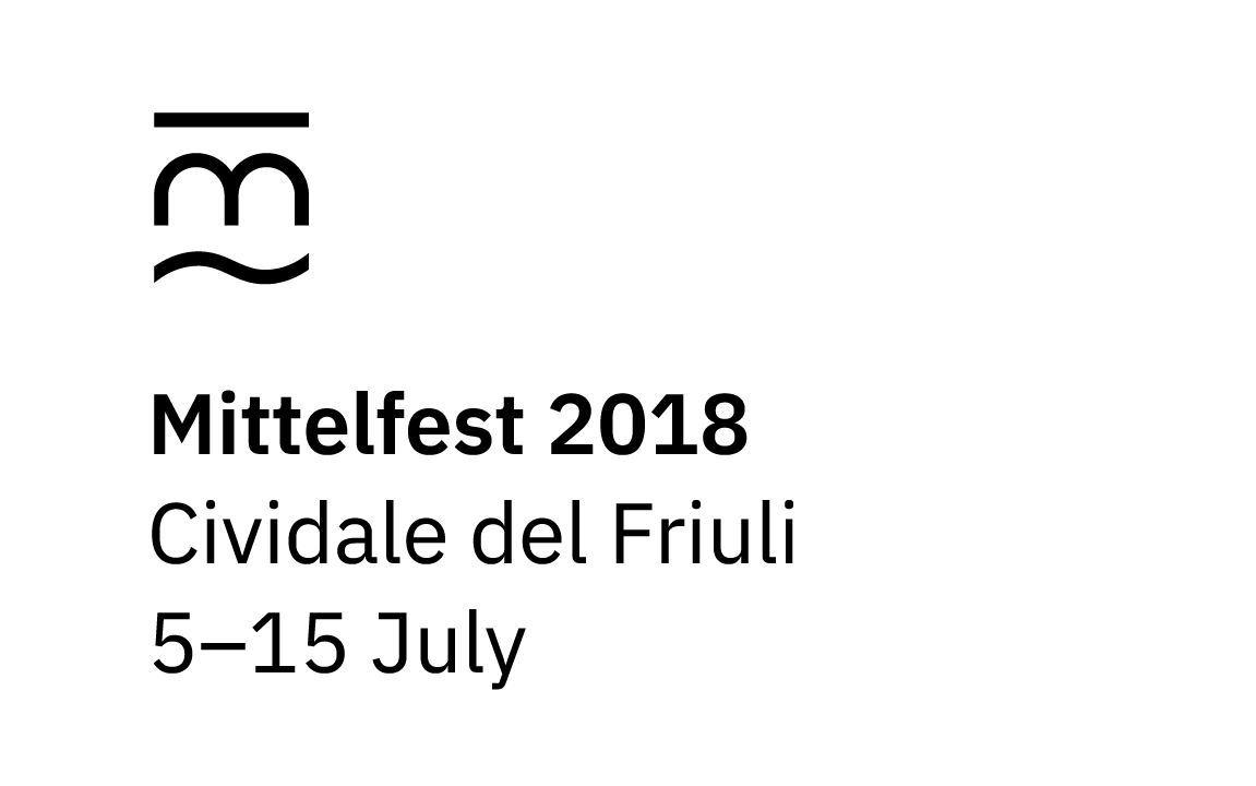
Mark
☻
Name
Mittelfest
Year
2018
Place
Cividale del Friuli
Date
5-15 luglio
Description
Festival di prosa, musica, danza, poesia, arti visive e marionette dei paesi della Mitteleuropa.
Theme
Millennials
Mark inspiration
We researched the city of Cividale del Friuli in order to find inspiration. We were impressed by the city’s architecture and it’s most characteristic feature—the Devil’s bridge, which is the first thing you see when looking through the window in the main office of Mittelfest.

New mark
Our aim was to design a mark which would derive from tradition and be perceived as an upgrade.


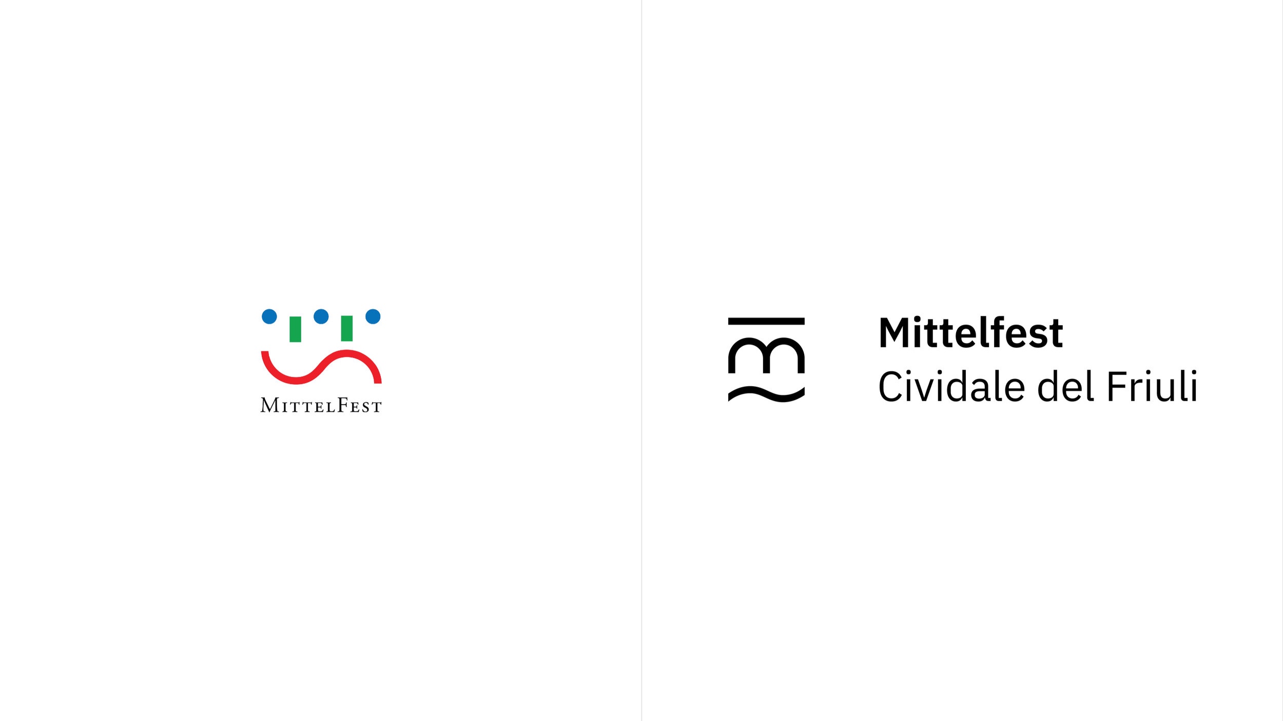
Final logotype


Comparison of old and new